Work / 01 / Brand story / Digital experience
The Willows
A family-run home with a history that deserved to feel present and warm online.

Residential aged care
Ashfield, Sydney
49 pages, strategy to build
Pre-launch staging
Care should feel human before it feels clinical.
The story
Family-run since 1977.
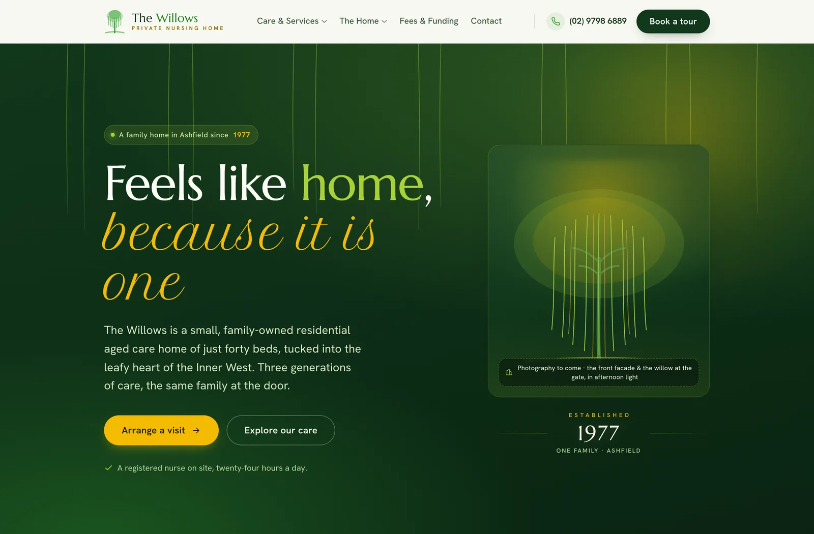
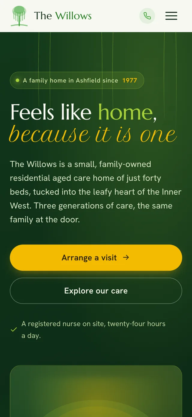
Forty beds on a quiet Ashfield street, and a phone that a person answers. The brief was to make that continuity present online: care, services, and enquiry paths easy to understand, with the warmth intact.
The scale
Forty-nine pages, none of them filler.
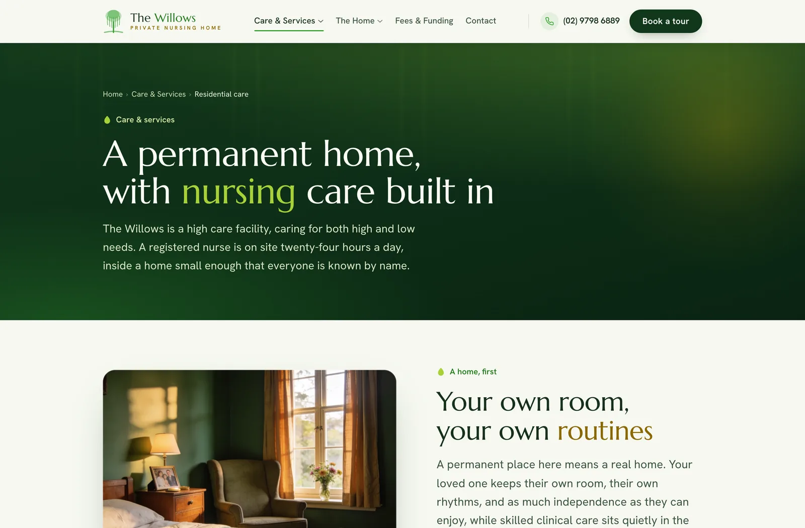
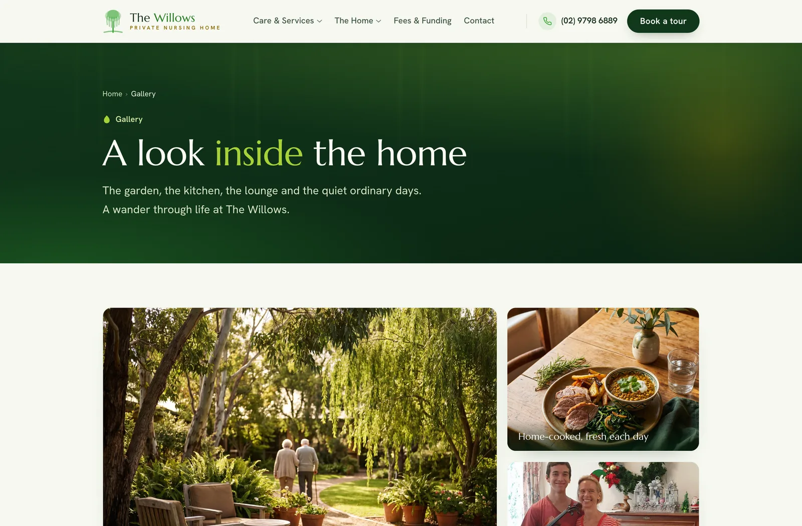
Five care pathways each got their own page. Fees and funding got explained in plain language with the disclaimers where they belong. Twelve event galleries, the home's blog, and 78 of its own newsletters were carried across, so six years of the home's life stayed part of its story.
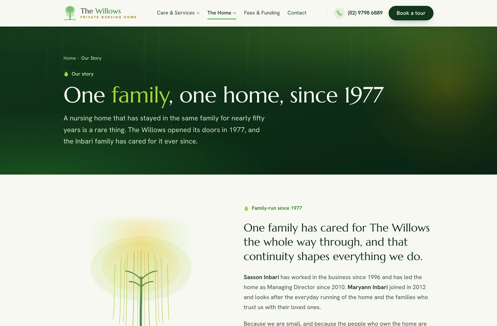
The design
Light through willows.
Green-tinted paper instead of aged-care cream. A forest and willow palette with an engraved Est. 1977 mark. Two competing homepage directions were built and the strongest parts of each merged into one. The typography stays warm without going soft.
The words
Come and see for yourself. The kettle's on.
The copy sounds like the people who answer the phone. No invented reviews and no star ratings of our own making: quality claims link to the government source where families can check them. Australian spelling, human sentences.
The correction
Reviewed against the business as it is.
The home's CEO walked the whole site against the current shape of the business, and the site changed to match: services corrected, leadership updated, and every removal finished so cleanly it looks like the page was always that way.
The frames